Presentation of Pechakucha
Based on Pechakucha’s first presentation, I would like to summarise a few points, as well as some areas where I need to improve.
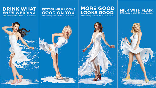
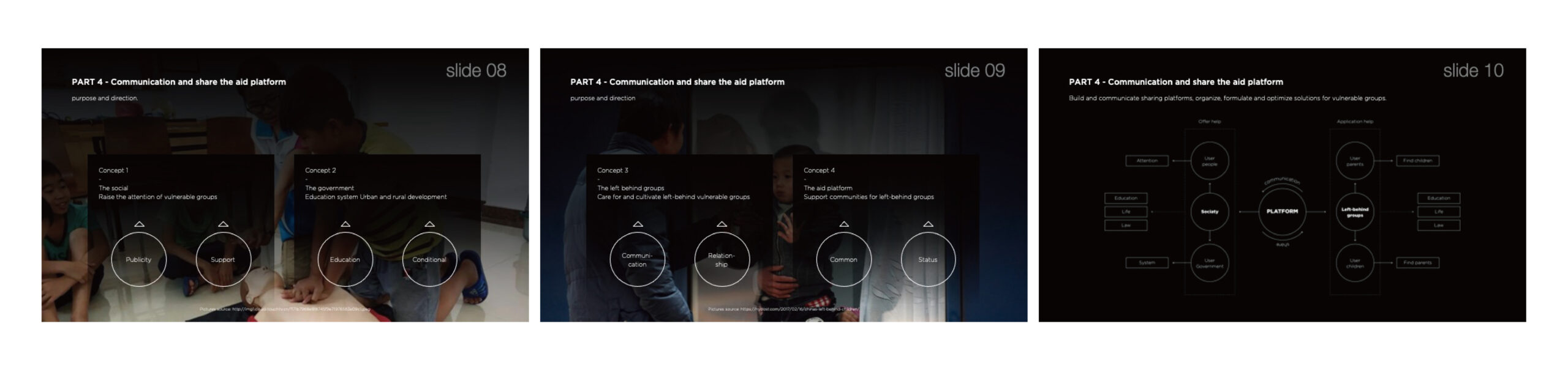
Firstly, I have learnt a few ideas. The content introduction should be interesting and can highlight the source of inspiration or abstract concepts so that they can be better communicated to the audience through our explanations. Keep it logically consistent; we don’t see more content in 20 seconds, so make sure the 20-second transition time is a reasonable way to present it. The entire content should be told and presented like a storyline, which will give the audience an effective understanding of the issues and allow the speaker to connect emotionally with the audience. At the same time, visual content should be displayed directly, with key information highlighted effectively and more conducive to the reading of visual information. The viewer does not have to read through the images too much, so limit the number of visual images. In terms of text, keep the number of words to a minimum and key core text can be labelled to aid the listener’s understanding. Within the overall vision, maintain consistency in stylistic design, graphic design and language design to enhance uniqueness.
In this Pechakucha process, my presentation of left-behind children was too simple, and I could not reflect too much concept and inspiration simply by adding photographs and words. At the same time, the consistency of photographic images leads to boring content, no main direction and no key issues. Only guaranteed visual uniformity, ignoring the rich source of inspiration. Secondly, due to the large amount of information on each page, the audience cannot fully understand it due to the limited reading time, which reduces the information interaction experience with the audience.
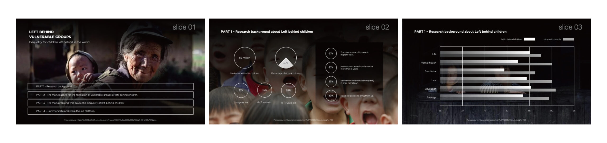
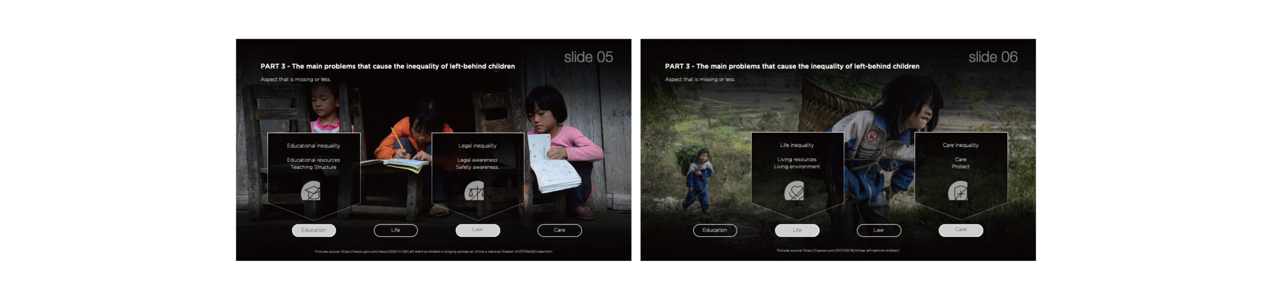
As for the advantages of the whole Pechakucha process, I just grasped the explanation time of each page of data and had a clear idea. After contacting for many times, the speed of speaking reached a stable state and kept a normal speed of speaking. I divided the whole ten pages into four parts. The first part is a one-page introduction of the theme, and a brief introduction and data presentation of left-behind children, as the research background, take up two pages of structure. The second part is an analysis of the reasons for the formation of this group, which occupies a page. The third part is a two-page list of the resulting inequities. The last section, which covers four pages, is related cases and solutions. The logic of the whole structure is relatively clear, but because the content is too literal, there is no visual effect of graphics, resulting in difficulties in visual understanding.


在项目四的第二部分中,我将更加关注关键信息的呈现,内容的逻辑顺序以及视觉样式的一致性。同时,增强与观众的情感联系使整个概念更加有趣和独特。
利亚姆
18/3/2021
最好的祝愿。