Abstract image and concrete image

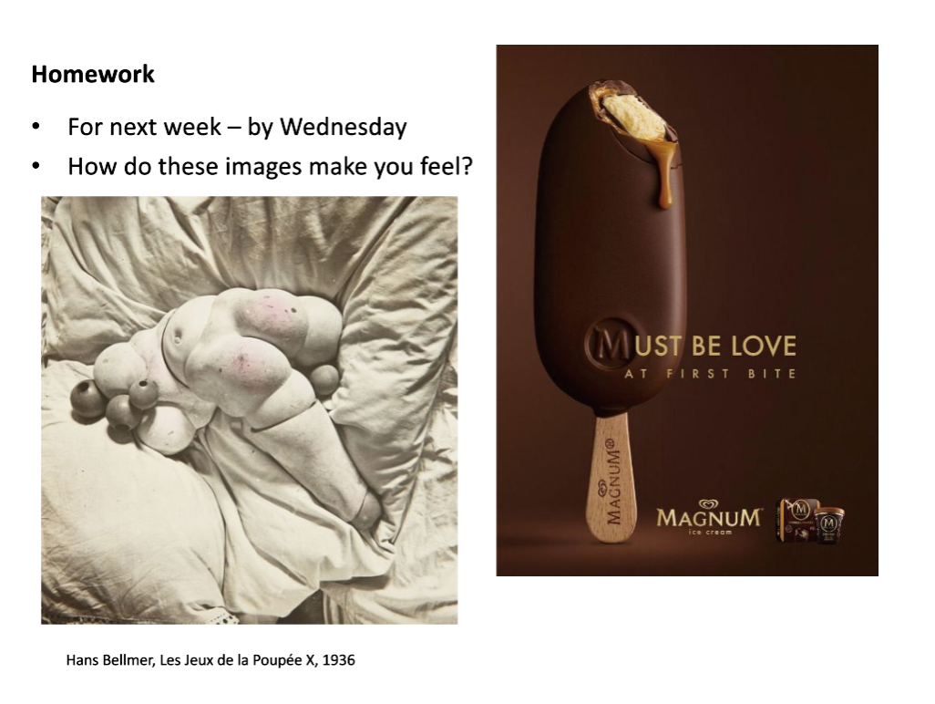
First of all, when I look at these two pictures, the first reaction is the comparison between abstract figure and concrete figure. It is very obvious that the left side is an abstract sculpture and the right side is a concrete commercial product. This can also be understood as the behavior of design within the scope of art and the behavior of design within commercial application. In artistic creation, design can give play to unlimited imagination. Perhaps it does not need to consider any norms and constraints, but more concerns about technology, materials, appearance, thoughts and other aspects. It may be just a concept, or it may be a criticism of a certain idea, which is in the leading position. In the business scope, design needs to pay more attention to communication with customers, stimulate consumption behavior through vision, and at the same time, explore the characteristics of the product. To maximize the visual optimization of the product, which is conducive to jump out of the competitive products.
Secondly, analyse the feeling of the first image alone, a sculpture placed on a soft cloth. Without considering the material, I would interpret it as an incomplete fat man. The author conveyed to me the idea of fat as beauty, rounded shape and harmonious background colour. The harmony of the whole picture is mentioned here, because of the relationship between colour matching, similar gray and white collocation will produce a sense of harmony. Or is it a kind of wrap and body critical thinking? Because it is wrapped in cloth, many of his works are composed of incomplete human bodies with bundles. I have confirmed this idea by looking at a series of works by the author.
Finally, the feeling of the second picture was analysed separately. A very delicate ice cream appeared in the picture. A close-up of a bite, a brown appearance, can make us want to eat. This is also the purpose of commercial design, to create atmosphere, to stimulate vision, to generate desire. And this kind of design means will make the product more intuitive to show in front of consumers. The author’s choice of colour matching also makes me feel harmony. No exciting colour appears. The text and background are the inherent colour of the product, which achieves the visual unity of the product publicity.
Liam
Best wishes.


