The feedback of blog

Question:
After a month of use of WordPress, I am familiar with space decoration, blog publishing and typesetting, but there are still problems with links and navigation. The main problem is in the menu links, unable to navigate to the specified section, resulting in the user can not effectively use the menu to understand the content and direction. This leads to the inconvenience of the interaction of the whole space, and the invalid interaction keys affect the user experience. It also destroys the whole visual structure. Secondly, in the classification of articles, there is no separation of blog, project, pas, photographic works, etc., and the whole content is too confused, which leads to the decrease of searchability. Then, the title of the article is too cumbersome and the layout is too complicated, which leads to the decrease of the user’s comprehension and readability. At the same time, the lack of a self-introduction section, which can improve the user’s understanding of me, conducive to communication.

Improvement:
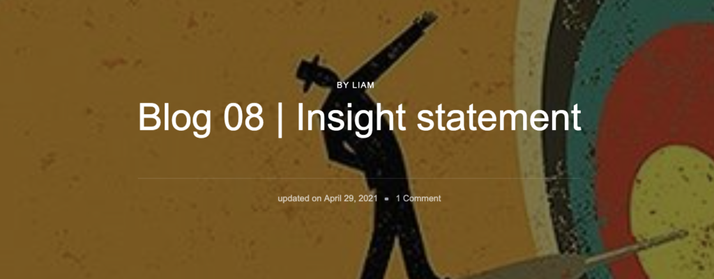
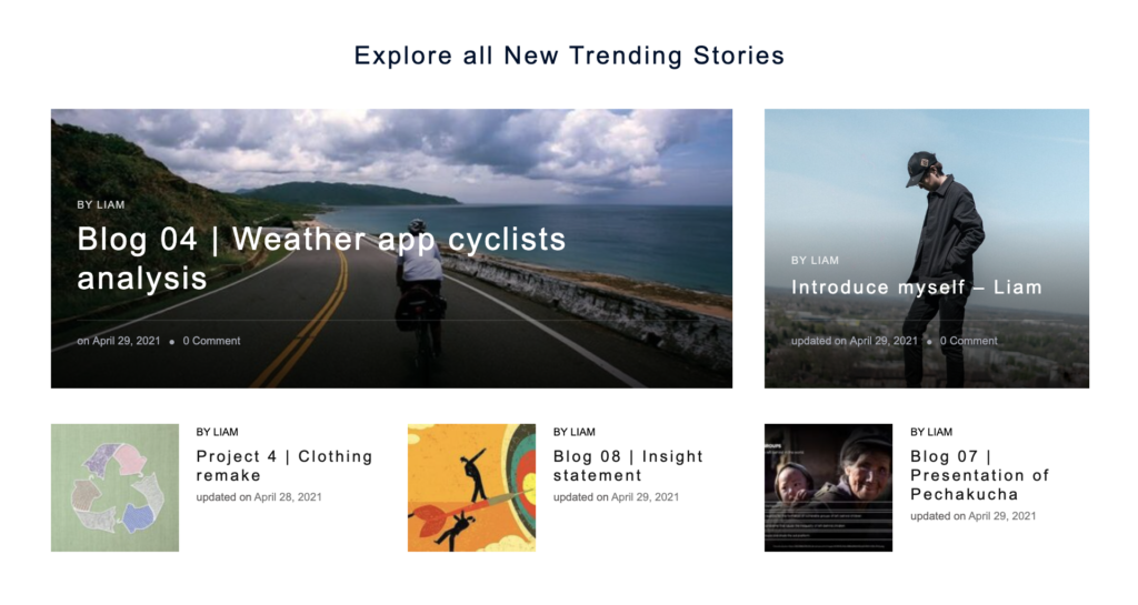
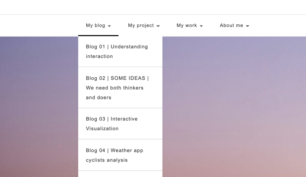
For the blog revision, first of all in the entire page of the layout I chose the simple style of black and white tone, large area of white space, highlighting the main content. And clearly show the profile picture and logo, establish personal brand awareness. Secondly, at the level of navigation interaction, the link of the plate is adjusted, and visual theme pictures are added to each blog and project, which plays a guiding role in the article. There are three categories and a self-introduction, including blog, project and work, which include my blog task, complete project content, paper analysis of PAS subject, and some personal photography works. The whole content structure is clear, categorization is clear. Thirdly, in terms of content, I have optimized and reduced the titles of each article to improve its readability and mainness. At the same time, each article has a previewable interface, with a short description of the article. Fourth, in terms of user experience, the optimization of navigation, content of sections, overall visual typesetting and article content make the whole space easy to use, not chaotic and logical.